Maintainable and Scalable CSS
The promise of CSS was that we can drastically alter a site's visual design without touching the HTML. As we do more front end development we realize CSS doesn't quite live up to this promise.
CSS plays a very important role in styling web applications. Best practice instructs us to implement Separation of Concerns (SoC) by keeping all styling in CSS files, all UI layout in HTML files, and all functionality in JavaScript files.
But if the goal is to write CSS code that is easy to maintain at scale, is this really the right approach? Anyone who has been writing CSS for a while, knows there are complexities that come with it:
At first when we learn how to code HTML, we are told to give our HTML elements semantic class names. Class names that describe the role of the element, rather than its visual features.
In a world of template tools like React, Handlebars, EJS, Twig, Angular VUE, is there still a need to class HTML in terms of role when we can easily abstract these HTML bits into semantically named components. We should be using class names to specify visual properties of the element. An example class like .container-inner.promo-status gives us absolutely no idea how the element will be styled. We have to do better.
Most UI changes occur in HTML. We modify the HTML and have to go back and revise any CSS that goes with it. But when modifying the CSS we become insecure in changing anything in fear that it might break something else. We then grep through the project in hope to find all instances where this selector is being applied and how it will affect the UI. In most cases we give up and simply write new CSS. Every team member therefore ends up adding and maintaining new CSS. This is not very efficient and not scalable.
As the CSS footprint becomes larger, it becomes more complicated and more difficult to reason about. Writing monolithic classes with complex rules that traverse the DOM might seem great and gives you a kick when big pieces of HTML get styled with a few lines of CSS. But it comes back to bite you when someone else or your future self returns to make changes. You now need to go through mental gymnastics to calculate and figure out what you were trying to do. CSS and its cascading feature is very powerful, but it does not help others that follow.
So what's the solution?
The solution is:
- Use utility classes.
- If you have to, add minimal custom utility classes.
- Never use semantic custom classes.
- Ensure your class names make sense and reflect visual features
- Keep classes specific
Traditionally, whenever you need to style something on the web, you write CSS.
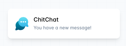
1<div class="chat-notification">
2  <div class="chat-notification-logo-wrapper">
3    <img class="chat-notification-logo" src="/img/logo.svg" alt="ChitChat Logo">
4  </div>
5  <div class="chat-notification-content">
6    <h4 class="chat-notification-title">ChitChat</h4>
7    <p class="chat-notification-message">You have a new message!</p>
8  </div>
9</div>
10
11<style>
12  .chat-notification {
13    display: flex;
14    max-width: 24rem;
15    margin: 0 auto;
16    padding: 1.5rem;
17    border-radius: 0.5rem;
18    background-color: #fff;
19    box-shadow: 0 20px 25px -5px rgba(0, 0, 0, 0.1), 0 10px 10px -5px rgba(0, 0, 0, 0.04);
20  }
21  .chat-notification-logo-wrapper {
22    flex-shrink: 0;
23  }
24  .chat-notification-logo {
25    height: 3rem;
26    width: 3rem;
27  }
28  .chat-notification-content {
29    margin-left: 1.5rem;
30    padding-top: 0.25rem;
31  }
32  .chat-notification-title {
33    color: #1a202c;
34    font-size: 1.25rem;
35    line-height: 1.25;
36  }
37  .chat-notification-message {
38    color: #718096;
39    font-size: 1rem;
40    line-height: 1.5;
41  }
42</style>
If we use a tool like Tailwind PostCSS, we would create a card like this using only utility classes.
1<div class="p-6 max-w-sm mx-auto bg-white rounded-xl shadow-lg flex items-center space-x-4">
2  <div class="shrink-0">
3    <img class="h-12 w-12" src="/img/logo.svg" alt="ChitChat Logo">
4  </div>
5  <div>
6    <div class="text-xl font-medium text-black">ChitChat</div>
7    <p class="text-slate-500">You have a new message!</p>
8  </div>
9</div>
Tools like TailwindCSS works by scanning all of your HTML files, JavaScript components, and any other templates for class names, generating the corresponding styles and then writing them to a static CSS file
This might not seem ugly, but when things are done this way, the follow issues are resolved:
- Removes all semantic class names.
- Our CSS doesn't grow.
- Can feel more secure when making changes.
- Extract components to remedy DRY issues.
- Maintenance of utility classes is much easier than maintaining large CSS files.
- Styling is specified in directly within the HTML.
Conclusion:
To write CSS code in a more maintainable and scalable way let's use utility classes. Aim to write no CSS. If you find yourself repeating elements with the same utility classes, extract those HTML bits to components.